
Heading
The image above is added by editing the node (Edit tab instead of this Layout tab) and adding an image in the image field.
If you'd prefer to add a full width image with text over it, like on the home page, don't add an image to the page like above and use the Hero Image + Header block in a section with the full container type setting. Keep in mind, this was designed for the home page, so consider if you really want to place it somewhere else. You may want to reserve something like this only for the home page.
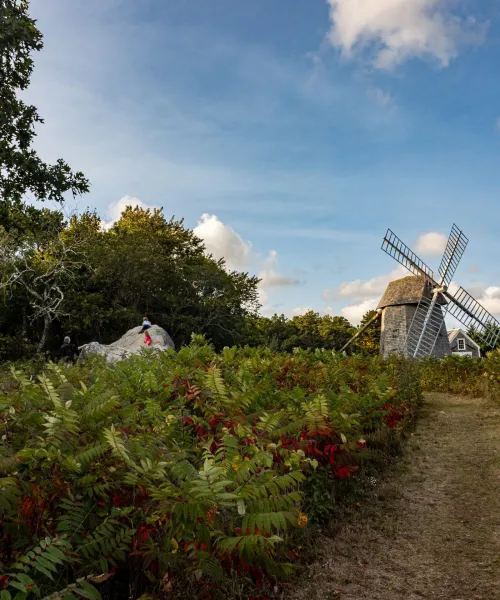
Example image caption
Example header text
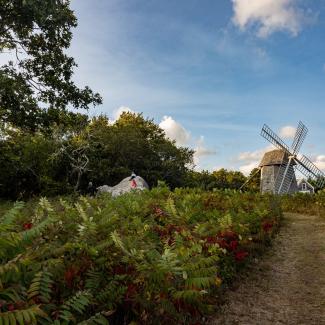
example image caption
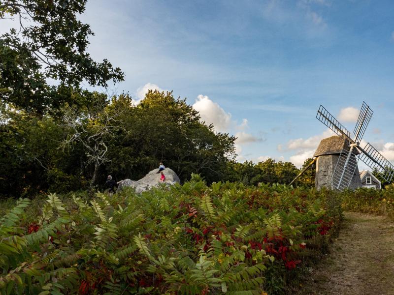
Example image + text block header
Example image + text block subheader
You can choose if you want this image to display on the left or the right. And if you want a background that has some white margin around it on wider screens, place this block in a section where you set a background style of "Paper texture with border." This block is best in a wide section if you want the border style.
Widths
There are four widths you may apply to sections. This text block is in a narrow width and this is the width you should select for single column text in most cases.
For a page where you want to display related pages menu on the right column, choose a section with two columns. Use the middle container type. Select with gutters. It will feel tight when you're looking at it in the Layout view, but it will be as designed when published. For column widths, use 67% and 33% on widest width, 100% on middle width, and 100% on narrow width.
To add the menu block, add a block but instead of clicking the blue button at the top, look down the list for the "Main Navigation" block option. Title it as you want (usually Related Pages) and adjust other settings to get the depth as you want it. This block won't display when it's narrow enough not to have multiple columns.
The middle container type is also appropriate if displaying Updates or Events content type in a single column.
The wide container type is good for displaying the featured links block type, as shown below.
Add as many as you want
These are the other blocks you can add: Quote, Accordion, Image, Video, and Logo Grid.
Title
Text Text Text Text Text Text Text Text Text Text Text Text Text Text Text Text Text Text Text Text Text Text Text Text
Title
Text Text Text Text Text Text Text Text Text Text Text Text Text Text Text Text Text Text Text Text Text Text Text Text
This is the body of the quote.
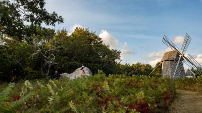
Caption
